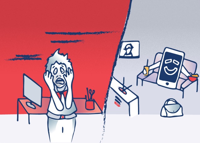
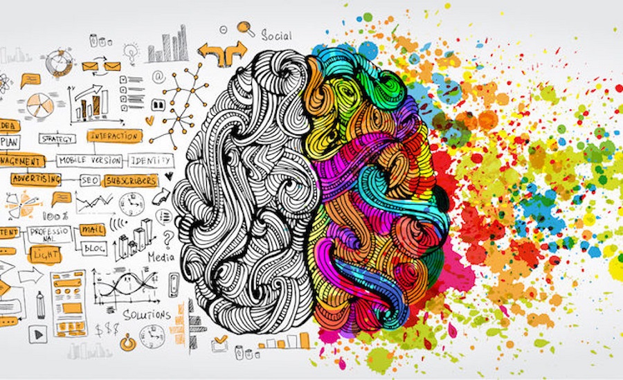
Colors are more than mere aesthetics—they hold the power to shape emotions, influence behavior, and communicate ideas without words. In design, understanding the psychological impact of color can transform ordinary visuals into compelling experiences that resonate deeply with audiences. Whether in digital platforms, branding, or interior design, colors subtly guide how people feel, think, and act.
The Emotional Language of Colors
Each color evokes unique emotions and associations, often influenced by cultural contexts. Designers leverage these associations to create experiences that align with their intended message.
- Red: Evokes energy, passion, and urgency. It grabs attention and stimulates action, making it ideal for calls-to-action, sales, or alerts. In Nepali culture, red is also associated with celebration and auspiciousness.
- Blue: Conveys calm, trust, and stability. It is widely used in corporate branding, tech platforms, and wellness websites to build credibility.
- Green: Symbolizes growth, nature, and balance. In Nepal, green often resonates with agriculture, sustainability, and environmental consciousness.
- Yellow: Sparks optimism, creativity, and warmth. It is a color that draws attention but should be used carefully to avoid overwhelming the viewer.
- Purple: Represents luxury, creativity, and spirituality. Historically linked to royalty, it can give a design a sense of sophistication and mystery.
- Orange: Encourages enthusiasm and energy. Often used in marketing and food design, it stimulates appetite and excitement.
- Black and White: Black signifies elegance, power, and sophistication, while white conveys simplicity, purity, and clarity. Together, they form timeless, versatile combinations.
How Colors Influence Perception
Colors do more than look attractive—they shape perception and decision-making. When used strategically, they enhance communication and influence audience behavior.
1. Brand Identity
Colors are central to brand recognition. A brand’s color palette conveys its personality and values. For example, a tech startup might choose blue to communicate reliability, while a wellness brand may lean toward green to signal natural and healthy choices. In Nepal, designers often incorporate colors reflecting cultural values to create local resonance.
2. User Experience and Interface Design
In digital design, colors affect usability and accessibility. Buttons, icons, and navigation elements rely on color contrast to guide user actions. Warm colors like red and orange can create urgency, while cooler tones like blue and teal offer a calming browsing experience.
3. Emotional Engagement
Designs that align color choices with target audience emotions can evoke stronger engagement. For instance, educational platforms can use bright, energetic colors to stimulate curiosity and learning, whereas meditation apps benefit from soft, muted tones to create relaxation.
Cultural Context Matters
Color psychology is not universal. Cultural context plays a pivotal role in shaping how colors are perceived. In Nepal, colors have deep symbolic meanings tied to festivals, traditions, and spirituality:
- Red: Worn during weddings and major celebrations, symbolizing joy and auspiciousness.
- Yellow/Orange: Associated with religious ceremonies and monks’ robes, representing spirituality and wisdom.
- Green: Represents fertility, nature, and harmony, often seen in rural landscapes and local craft.
Designers must consider these cultural nuances to ensure colors resonate appropriately with the intended audience.
Applying Color Psychology in Design
Practical application of color psychology involves more than selecting favorite colors. It requires strategy, testing, and consistency.
1. Define the Emotional Goal
Determine the primary emotion or response you want your audience to feel. Is the goal excitement, trust, calmness, or curiosity? Your color palette should reinforce this emotional objective.
2. Maintain Balance
Overuse of bold colors can overwhelm, while too much neutrality may appear dull. Balancing primary, secondary, and accent colors ensures harmony and effective communication.
3. Test and Iterate
Color perception can vary across screens, lighting, and cultural backgrounds. Conduct user testing to understand how your target audience responds to different color choices and make adjustments accordingly.
4. Combine with Typography and Layout
Colors do not work in isolation. The interplay of typography, spacing, imagery, and layout influences how the color message is perceived. Complementary designs enhance readability, focus attention, and strengthen emotional impact.
The Future of Color in Digital Design
With advances in AI and digital interfaces, designers can now analyze user behavior and personalize color schemes for optimal engagement. In Nepal, the fusion of traditional aesthetics with modern digital design offers exciting opportunities to leverage cultural colors for emotional impact. Designers can create websites, apps, and digital experiences that are both visually stunning and psychologically engaging.
The psychology of colors is a powerful tool in design, bridging aesthetics with emotion. By understanding how colors influence perception, behavior, and cultural resonance, designers can craft experiences that connect deeply with audiences. In Nepal, where color carries rich symbolic meaning, thoughtful design can harmonize tradition with modern innovation, creating visually compelling narratives that leave lasting impressions.
In essence, colors speak a universal language, yet they are most impactful when paired with cultural awareness, emotional insight, and purposeful design strategy. Whether you are building a brand, designing a website, or curating a space, the right color choices can transform ordinary designs into extraordinary experiences that truly resonate.